Visual analytics is a new interdisciplinary science aimed at drawing inference and conclusions from data. In contrast to standard machine learning or statistics, visual analytics emphasizes information visualization, interactivity, and analytic reasoning. [http://smlv.cc.gatech.edu/2010/03/17/what-is-visual-analytics/]. It is an outgrowth of the field’s information visualization and scientific visualization, which focuses on analytical reasoning facilitated by interactive visual interfaces. [http://en.wikipedia.org/wiki/Visual_analytics]
If you really want to go into the depths of VA then you can attend a few web lectures from Georgia Tech here
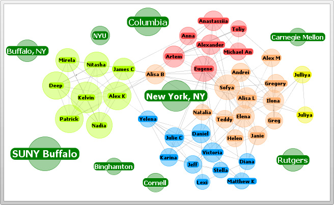
A few years back digg.com had these great visualizations – stack, swarm and big spy; though they seem to be out of service now. (see Where Have Digg Labs Gone?)
A related disciple is text analytics. The term text analytics describes a set of linguistic, statistical, and machine learning techniques that model and structure the information content of textual sources for business intelligence, exploratory data analysis, research, or investigation. [http://en.wikipedia.org/wiki/Text_analytics]
 A tag or word cloud is related to text analytics. We all have seen these tag clouds over the past couple of years. Tag clouds are an informative image that communicates much in a single glance. Word clouds are easy to read, analyze and compare, serve a variety of useful purposes including visual analysis of qualitative data. For example using FDA Medical Devices CFR - Code of Federal Regulations Title 21 and TagCrowd I created this visualization (clearly showing that the major emphasis of this regulation is on manufacturers.)
Coming to the PLM domain, if we can process product data in such a method then we can arrive at a number of interesting observation very easily. For example to show which product has how many change requests? Or which product uses the least parts from a standard library. It can be easily done and if there is an enormous amount of data in an organization such visualizations can offer great information to executives very intuitively.
This sort of visualization when brought into an enterprise can easily put in the picture about a multitude of different things, like for example; a change in a standard part is going to affect how many products down the line, etc. I believe Visual analytics will lead to creative problem solving and faster solutions to problems will drive higher product profitability.


